I was just catching up on my YouTube subscriptions and stumbled across yet another, under tested (assuming it has undergone ANY testing) “feature”.
“Turn down the lights”
This only seems to show on the long videos, i noticed it on a 50 minute ofcom talk (don’t ask why, but i like to keep up with the media and communications sector).
I have to say, this seems to be the best example of simply little to no testing being done before things go live, and frankly it is totally unacceptable of a company/website like YouTube/Google.
YouTube and Google literally have hundreds and thousands of developers (its rumored it costs $1 MILLION a day just to feed them), and they are FAILING to produce decent features.

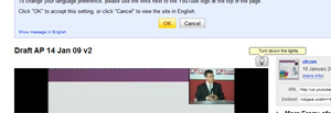
Okay so first off lets show how this looks on the page.
Exhibit A clearly shows the YouTube coders need to learn how to code.
Because the “Turn the lights down” button has bumped up the title of the video, leaving a lot of wasted white space around the top area. This is BASIC coding, and YouTube should not have this problem. End OF!
[ad name=”posts”]
(You can also see the language selection box “feature” which STILL won’t leave me in peace and insists that it must know – Do i want to view the site in English or English.)
Also before any of the people who know I generally prefer to use IE7, this isn’t just IE… its FireFox too – not browser issue, it’s YouTube.
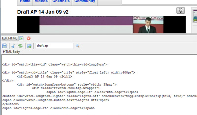
Just to prove my point slightly, i even went to the trouble of proving it can be done better.

Within 5 minutes (including the time it took to download and install the editor plugin) I had hacked about a bit and got them looking better. Obviously it can be done better. But it shouldn’t be done by me (at least not until I’m on the payroll!).
– Plugin used: http://chrispederick.com/work/web-developer/ –
Of course, i do seem to rant about YouTube and their handy little “features” and changes, but this ones really got me, and it gets worse.
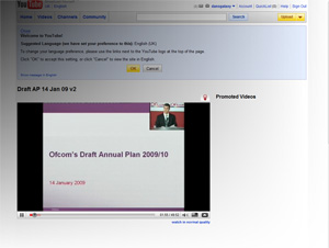
So when you click the “Turn down the lights” button to adds a kind of lightbox effect to the area around the video and hides the sidebar and other boxes next to and below the video itself. (Note the fact that the “Promoted Videos” title is left floating mid-screen)
 As you can see it seems YouTube tried to get fancy and be different by not just making the background fade but by adding gradient to the fade, so the top left hand corner is much darker and fades off into the bottom right, however frankly this looks crap, and a normal lightbox style would be much better.
Also why couldn’t they have some nice JS “move” the video into the center of the screen, and maybe enlarge it? I assume the idea of putting it only on long videos is they expect users to watch them, and want to make it easier and less distracting? Well surely a centered slightly enlarged version is much better than just hiding the sidebar which now leaves a HUGE empty void above and below the video!
You guessed it! It GETS WORSE!

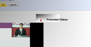
Not only this but now when you hover over the “Turn up the lights” icon it totally destroys the gradient around the area of the pop-up.
And leaves it looking like like someone cut a chunk out the gradient and then refilled it with another gradient.
This kind of thing just really bugs the hell out of me, its terrible, its buggy, its crap, pointless, pathetic attempts and showing off what they can do and they have failed.
Maybe the credit crunch is to blame, everyone else is blaming everything on the “economic climate”… maybe Google/YouTube had to give the entire debugging team the sack as they running a little short on cash? After all a majority of Googles money comes from ads…
The worst part is you just know that this kind of thing would have been picked up in minutes if the people who developed this went to Bob in the next office and said mind taking a look at what i just done?
YouTube, you fail.
BETA TESTING IS WHAT YOU NEED! I will keep saying it until you start listening!
[ad name=”posts”]

I hate to say it, but Megavideo does this effect a lot better…mainly because it works in IE7 and FF.
I used to love MegaVideo used to watch tons on it, but since they changed it has sucked for me 🙁
Slow laggy and just totally stopped working, it was at a point where it just didnt load any of the videos at all, in all browsers (EVEN after a total reinstall of my OS)…
Also, i seem to be getting good at ranking high.
This blog post is 1st page on google for “Youtube turn down the lights feature” (and this post is linked to from the 3rd result) and is second result on second page for “youtube turn down the lights”
So im quite pleased with that really 🙂 go me.
They just need to ask Bob in the office to take a look and then realise that they don’t have a clue what they’re doing….
And why does it only work on long videos???
Matt – Long videos are assumed to be movies / Featured content.
Also, Anyone notice google has removed this page from the listing? Seems google does not like people bad mouthing it’s piece of shit youtube.
I think that the issue in this instance as it is in many;
Is that the developers don’t care, the company already has the money, the activity, and the developers are already getting paid, regardless.
There’s minimal chance that the Chair of Google / Youtube even looks at their own websites now, and even when they do they are merely glancing and not fault picking.
All of the above thrown in with a side-order of Little-to-no-Beta Testing adds up to one great big dish of unprofessional, poor quality work production.
It’s “turn down the lights”, not “turn off the lights”. I think it’s intended for some of the page to still be visable.
It doesn’t make sense. If I just want to see the video I go fullscreen, or preferably download the video and watch it in a player with more controls for seeking etc.
And for some strange reason it depends on google-analytics.com, so if you block that domain to keep some privacy it doesn’t work. And if you have your adblocker disabled, the ads are not dimmed down!
Thanks for the comment Miz Bee.
Yes i get your point, it does seem a bit of a non-issue to an extent, although i can see the benefits of this kind of feature (when done correctly) becuase its like full screen but then has the flexibility for the user use other windows etc…
They again had a go with this feature… didn’t last long… circa 2 mins lol
Wow, what a douche you are. What’s your problem? Way to find something asinine to bitch about.
I hope you lose a significant amount of money down the back of your couch, and your car keys fall into a drain.
Wow thanks…
My problem is simply, I expect better of Google, they have the resources and money to not make these little mistakes and to ensure they properly test their changes before making them live to the public…
If I had a car or my ouch couch to loose money and keys it might bother me more.
Other than that, stop being a silly troll and either contribute something to this or bugger off.
cheers 🙂
Oh come ON, don’t be retarded, the fact that you referred to an HTML error as “coding”, shows you have no idea what you’re talking about either. UH OH! A site made an error, give me a break, anything to make yourself look smarter.
Excuse me… I know exactly what I am talking about thank you.
First off, there is nothing wrong referring to HTML, CSS, PHP or in fact any programming or Mark-up language as “code”.
I having been coding or should I say authoring websites for good few years now, I sell my services doing so and run a web hosting company so I do have a good idea about what I am talking about.
Also it isn’t so much that “a” site made an error, its more the fact a site which in my opinion shouldn’t made simple errors made the error, because in my opinion a massive website like YouTube which is run by the largest internet corporation to ever of existed with the best and brightest working for them… well now when you have those resources there really is NO reason to have things like this… where was the testing? where was the monkeys checking how this looked on every browser and operating system before it went live?